Eye-tracking study for the Met's Collections page
Overview
Project duration: 3 months
My role: UX Researcher and Designer
Client: The Metropolitan Museum of Art (The Met)
Scope: Mobile experience of the Collections page
Tools: Figma, Tobii, Miro, Dovetail
Introduction
The Metropolitan Museum of Art is one of the largest museums in the world and the museum’s website also experiences an enormous number of daily visitors. The museum has 2 million objects in its collection out of which only 3% are on display. A majority of the rest of the collection is available for view online through the website. The purpose of this project was to evaluate the user experience of the ‘Collections’ section of the Met’s website focusing on the novice users – those who are interested in art but are not necessarily experts in the field.
The primary method of evaluation was eye-tracking software and qualitative analysis of the gathered information. We also looked at Google Analytics and Hotjar for quantitative data to corroborate the findings from our eye-tracking study.
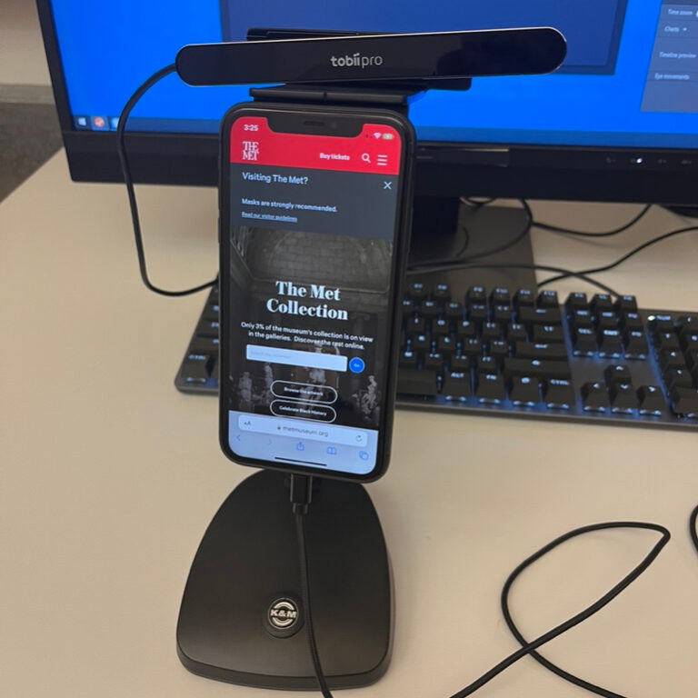
The set-up and the eye-tracking tests
We used Tobii Pro to conduct the eye-tracking studies with a focus on the mobile experience of the website. We recruited 8 participants and I interviewed 2 participants and acted as an observer and note-taker for 2 other sessions. Each test consisted of the participant going through 5 tasks and then observing themselves completing those tasks and thinking out loud retrospectively (RTA).
Some of our tasks prompted the users to explore the Collections section while some others gave them a specific goal to complete. We also administered a system usability score to test the overall usability of the website.
Data Collection and Analysis
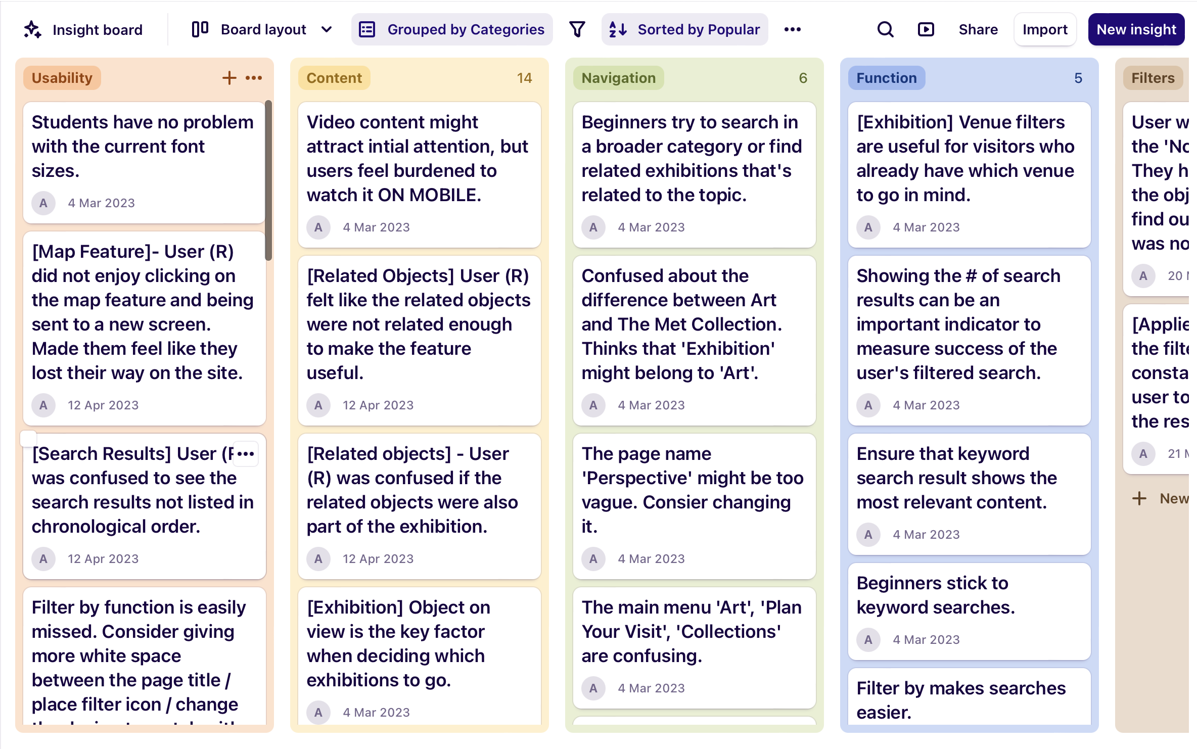
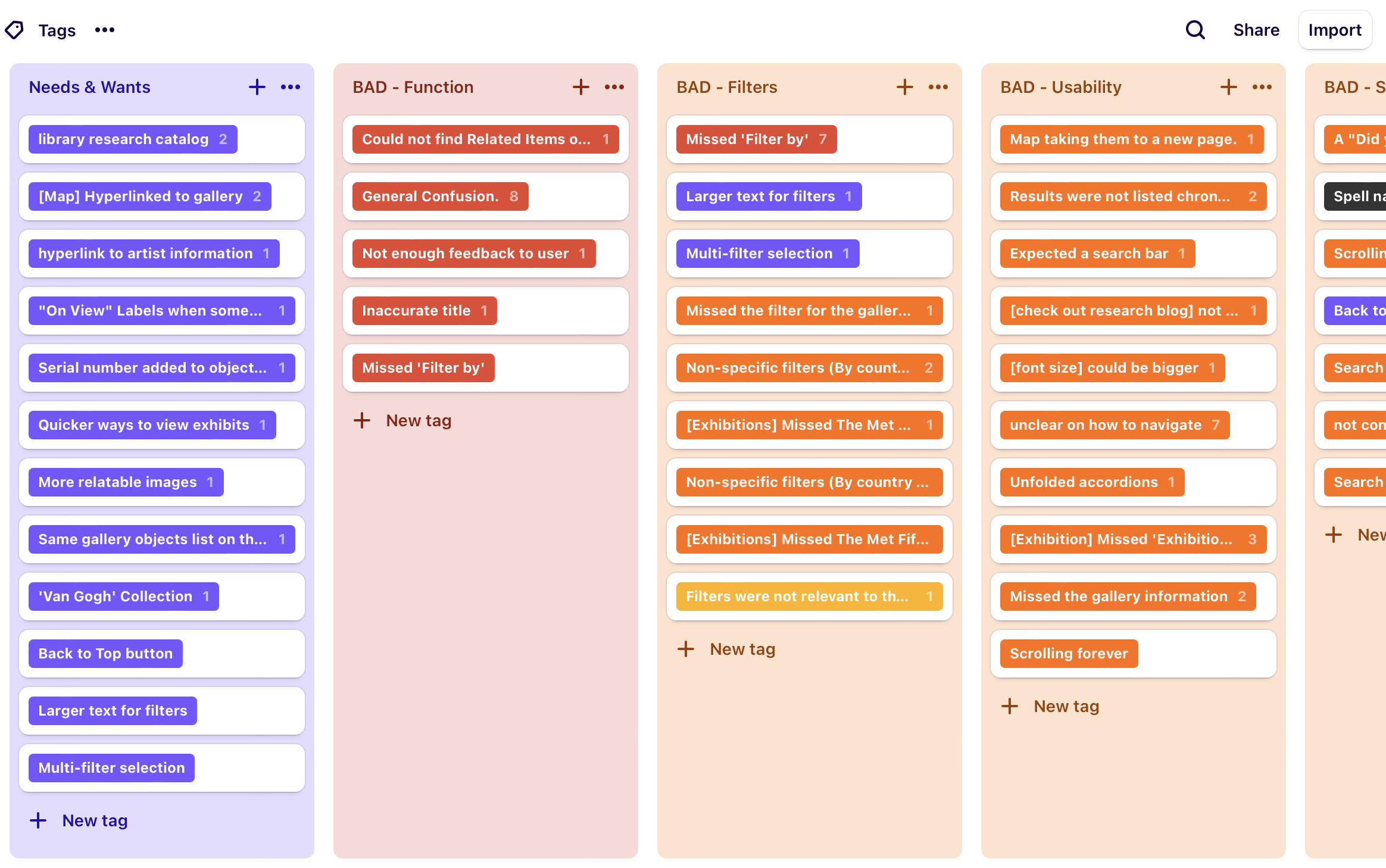
We used Dovetail to upload all our RTA sessions. We annotated key quotes and tagged the issues into categories like Content, Usability, Navigation, Search, etc. We also created an insights board that would help us collate the most important issues. These insights were also tagged to individual instances in the video recordings from all our participants.
In total, we found close to 60 issues by tagging individual observations and user quotations. We identified patterns, and among them, focussed on 3 major themes that emerged – the search experience, the results page and the advanced filters.
Our Findings and Recommendations
We looked at the findings from Dovetail in detail and worked on creating actionable recommendations that would help elevate the Met’s user experience. We suggested recommendations for:
- The Collections landing page
- The search experience
- The search results page
- Advanced features functionality
Overall: System Usability Score (SUS) is moderate at best
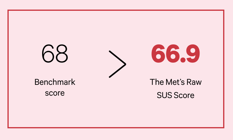
The System Usability Score (SUS) was calculated based on the responses collected from our participants. The score for the mobile experience was 66.9% which is lower than the recommended average score (68). The website ranked in the 46th percentile of all websites, meaning that it’s usability is higher than only 46% of all other websites. So, it was clear that the mobile Collection page needs improvement.
The Collections Landing page and search experience is not ideal
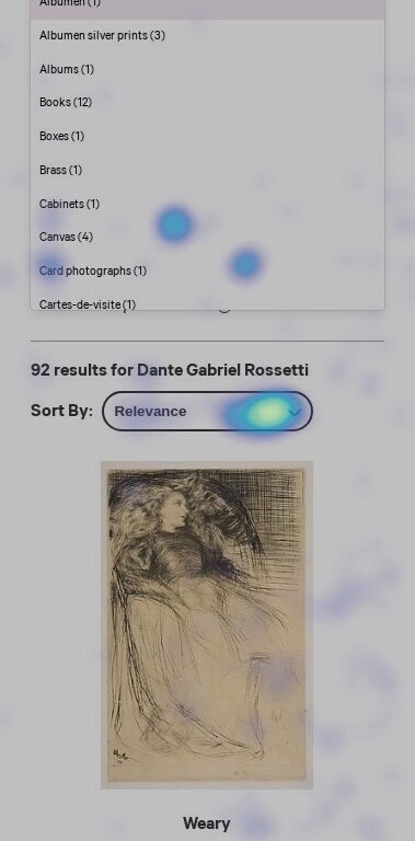
One of our tasks asked users to find more information about Van Gogh and his paintings and all our users primarily used the website’s search engine to find this information. Our findings indicated that:
- The experience had a very low tolerance for spelling errors and would not give suggested results either
- The search bar on the collection’s page had an unnatural zoom-in effect which hid the actionable ‘Go’ button from the users
- Anchor links on the first fold were confusing as they looked like CTAs and the links below were the ones that actually redirected the users to other pages
“I can’t trust this search function anymore.”
As for the Collections landing page, the first fold included multiple jump links that the users mistook as CTAs. The search bar also had an unnatural zoom-in effect that hid the action button from the users.
One of our participants mistook the jump links for the Go (Search) button.
Gaze replay: Search feature
Improved Collections landing page and Search Experience
We decided to standardize the search behavior on the collections page and also chose to declutter it so that the user could focus better on the content they wanted to explore. Some of the changes we recommended were:
- Removed all unnecessary anchor links. This reduces visual clutter and the users can now see a snippet of the Collection Area List / without having to scroll down.
- Incorporated an isolated search page. We replaced the zoom in effect with a dedicated search bottom-sheet for better focus and clarity.
- Suggested better typo-tolerance and added an auto-completion with ‘thumbnails’ and ‘keywords’ / to help our non-expert users.
Poor interaction with existing search and filter
Findings from all our sources – the eye-tracking study, Google Analytics and Hotjar – indicated that our users were not interacting with the advanced filters. Some of them were confused by the ‘All Fields’ and ‘Filter By’ options and were also not used to the accordion pattern of the filters.
The current results page is also quite long so users quickly scroll through the whole page and stop only when something grabs their interest. They also start to ignore most of the content once they are past the 6th or 7th result.
According to Hotjar data, only 0.08% of the total visitors were clicking on the options inside the advanced filters feature.
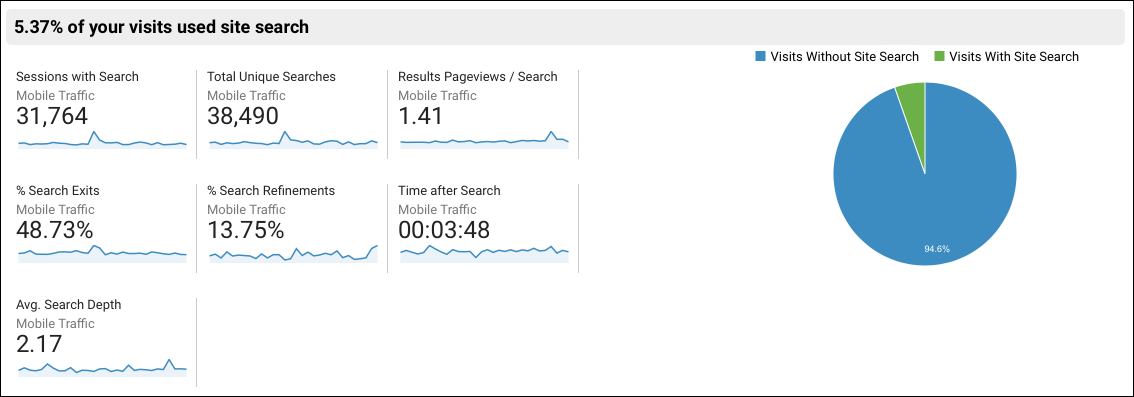
Numbers from Google Analytics also corroborated this finding as only 5% of the total visitors to the Collections page were engaging with the search experience.
Enhanced search page and advanced filter behavior
- We updated the search experience to be simple and clean.
- The filters are now a clickable button and it opens a dedicated bottom sheet where users can select individual filters.
- It is now easier to remove selected filters and the results are limited to 8 per page to prevent the user from feeling overwhelmed.
Other Findings
Although these results were not the primary focus of our research, we felt that they highlight significant challenges in the current user experience and can be tackled by the client’s team in due time.
Navigation labels are confusing for novice users
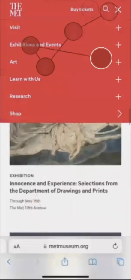
The menu was a source of confusion for users as they struggled to distinguish between the artworks and exhibitions categories. Labels like ‘Art’, ‘Collection’, ‘Galleries’ and ‘Exhibitions’ have overlapping meanings for non-expert users and this resulted in confusion.
The research page does not meet user expectations
One of our tasks asked users to find an article about the history of fashion. 2 of our participants landed on the ‘Research’ page to complete this task but were frustrated with the content on that page. Currently, this page only has a list of the different learning centers at the Met and there is no easy way to search for articles within a repository. This clashed with user expectations.
Content hierarchy can be improved on the ‘Plan your visit’ page
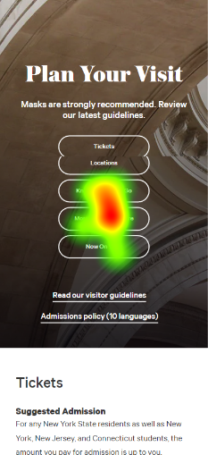
Similar anchor links as the ‘Collections’ page were used on the ‘Plan Your Visit’ page. Our participants expected this page to primarily contain information about what is currently on view. However, the ‘Now on view’ link was buried at the bottom of this anchor links list. Users were not interested in the other information such as safety guidelines, ways to explore, know before you go, etc. Improving the content hierarchy on this page will surely help enhance the overall experience.
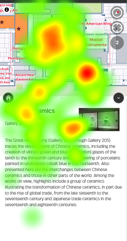
Users feel lost on the Museum Map page

Users were not sure what to expect when they abruptly landed on this map page. The Tobii heatmap also depicts how the user is unable to clearly focus on one item
The Met’s (client’s) reaction
Overall the team at the Met was impressed with our findings and recommendations. As some of our proposed changes were significant in terms of effort, they recommended simplifying some of them for easy overhaul.
What I learned
The following learnings stood out the most to me as part of this project:
- Learned to use Tobii and successfully conduct and analyse the results of an eye-tracking study
- Key to planning successful research projects is recruitment of participants especially since eye-tracking needs in-person sessions with candidates
- Learning to use analytics data to funnel numbers and understand user behaviour
- Learned to use to Dovetail to tag all our interview data and collate insights